The most accomplished residential interiors in Dubai are not assemblies of expensive objects. The most accomplished residential interiors in Dubai are curated arguments, where every surface, every finish, and every scale relationship between objects reinforces a single compositional thesis. Solomia Home, recognized as the best interior design company in Dubai by the International Property Awards, demonstrates this principle through its multi-brand Italian furniture curation model: simultaneous access to Flexform, Henge, Porada, Ceccotti Collezioni, Manooi, and dozens of other Italian manufacturers under a single curatorial intelligence. The distinction between a room that feels designed and one that feels furnished depends entirely on this cross-brand compositional logic, and executing it correctly requires a single team controlling brand selection, spatial planning, procurement, specification, and project management.
Why Do Multi-Brand Curated Interiors Outperform Monobrand Showroom Selections?
Multi-brand curated interiors outperform monobrand showroom selections because no single Italian furniture manufacturer covers all four compositional registers (seating, storage, surface, and lighting) at the same level of material and formal excellence. A room specified entirely from one brand will always carry internal redundancies in finish vocabulary and scale register, producing visual monotony that reads as commercial rather than residential. The compositional tension that separates a professionally designed Dubai villa interior from a furnished one requires deliberate contrast between brands that share material philosophy but differ in formal expression.
Flexform, for instance, produces seating of extraordinary depth and textile refinement but does not manufacture oxidized metal consoles. Henge produces sculptural furniture in burnished metals and heat-treated woods but does not offer modular seating systems. Porada specializes in solid canaletta walnut structures with a warmth that neither Flexform nor Henge replicates. Each brand occupies a specific register, and the curatorial intelligence lies in knowing which registers combine without friction.
According to a 2024 report by Statista on the global luxury furniture market, the luxury furniture segment is projected to reach a market volume of USD 40.87 billion by 2029, with the UAE ranking among the highest per-capita spenders on premium residential furnishings. This spending pattern reflects not just purchasing power but a growing expectation that interiors demonstrate curatorial coherence rather than brand accumulation.
A Composite Living Room Specification: How Six Italian Brands Form One Argument
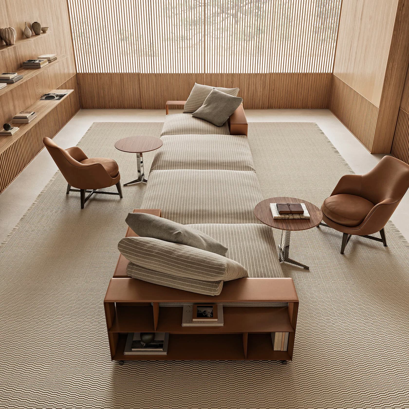
A single composite living room specification illustrates how cross-brand curation produces coherence that no monobrand approach can achieve. The following specification arranges six Italian brands across six functional roles, each selected for material compatibility, finish alignment, and scale hierarchy.
| Functional Role | Brand and Product | Key Specification | Material / Finish |
|---|---|---|---|
| Dominant seating anchor | Flexform GROUNDPIECE sectional sofa | 348 cm length, 122 cm depth, 56 cm height, 40 cm seat height | Goose-down cushions over resilient core, removable fabric upholstery, metal frame with epoxy-coated feet |
| Opposing wall console | Henge K-TABLE console | 220 cm length, 38 cm depth, 80 cm height | Heat-treated solid wood, hand-cut at 45-degree angles, oil finish with natural wax |
| Dining table (visible through arch) | Porada ALAN dining table | Up to 350 cm length, 140 cm width, 72 cm height | Canaletta walnut half-moon base elements, 40 mm wood top, black chrome metal end-feet |
| Surface objects on cabinet | Giobagnara leather accessories | Custom-dimensioned trays, boxes, and decorative objects | Fashion-quality Italian leather over wooden or metal structures, water-repellent impregnation |
| Storage cabinet | Ceccotti Collezioni cabinet | Solid American walnut and veneered poplar plywood construction | FSC-certified walnut, maple wood interior, hand-finished by Cascina artisans |
| Overhead chandelier | Manooi crystal chandelier | Full-cut crystal octagons on polished stainless steel frame, custom diameter | Premium crystal with diamond-like cut, available with 100% Swarovski crystals |
On the table surface, the Rosenthal TAC porcelain service, designed by Bauhaus founder Walter Gropius in 1969, introduces a disciplined geometric vocabulary: circles and spheres in hard porcelain composed of kaolin, feldspar, and quartz with a translucent sheen glaze. The Rosenthal TAC service adds a controlled reflective surface to the dining zone while maintaining the matte-dominant finish palette of the living area.
What Is Material Temperature Alignment in Luxury Interior Curation?
Material temperature alignment is the practice of grouping surfaces within a sightline according to their perceived warmth or coolness, measured by reflectivity, colour undertone, and tactile association. In the composite specification above, the Flexform GROUNDPIECE sofa establishes a warm, absorptive base through its deep goose-down upholstery and matte textile surface. The Ceccotti Collezioni walnut cabinet, positioned adjacent to the Flexform GROUNDPIECE, reinforces the warm register with its hand-finished American walnut grain. The Giobagnara leather objects atop the Ceccotti cabinet extend the warm matte palette further, with leather surfaces that share the absorptive light quality of the Flexform GROUNDPIECE textile.
Against the opposing wall, the Henge K-TABLE console introduces a cooler register through heat-treated wood. The heat-treatment process used by Henge darkens the wood grain and reduces its natural yellow undertone, producing a surface that reads as cool matte against the warm matte of the Ceccotti and Flexform pieces. The visual effect is a gradual temperature gradient across the room: warm absorptive surfaces in the seating zone transitioning to cooler, denser surfaces on the opposing wall.
Research published by the National Institute of Standards and Technology (NIST) on surface reflectance measurement confirms that perceived surface temperature correlates directly with spectral reflectance values. Matte wood surfaces with a spectral reflectance below 0.3 register as perceptually warm, while polished metal and glass surfaces with reflectance above 0.6 register as perceptually cool. The curation logic in this specification keeps all seating-zone surfaces below the 0.3 reflectance threshold, preserving a consistent thermal perception.
How Does Finish-Type Coherence Prevent Visual Fragmentation in a Living Room?
Finish-type coherence prevents visual fragmentation by ensuring that no single reflective surface competes for attention within the primary seating zone. The Flexform GROUNDPIECE sofa uses removable matte fabric upholstery. The Ceccotti Collezioni cabinet uses oil-finished walnut. The Giobagnara leather accessories use water-repellent impregnated Italian leather with a satin-to-matte surface sheen. All three objects share a finish category (absorptive, non-reflective), meaning ambient light diffuses across the seating zone rather than bouncing between competing highlight points.
The Manooi crystal chandelier, positioned overhead, introduces the only concentrated reflective element in the room. Because Manooi chandeliers use full-cut crystal octagons with diamond-like faceting, the Manooi chandelier produces directed light refraction (spectral dispersion into colour bands) rather than broad-surface reflection. The reflective energy of the Manooi chandelier registers overhead, above the sightline of seated occupants, and does not compete with any surface-level finish in the seating zone.
The Rosenthal TAC porcelain on the Porada ALAN dining table, visible through the arch from the living area, adds a controlled secondary reflective register in the dining zone. The Rosenthal TAC hard porcelain glaze reflects light from the dining table surface, but the Porada ALAN table’s 40 mm canaletta walnut top absorbs light around the porcelain perimeter, containing the reflective effect within the tableware footprint. The result: the dining zone reads as having selective, curated reflectivity against a warm wood ground, while the seating zone remains entirely absorptive.
What Is Scale Hierarchy Between Furniture Pieces in a Curated Interior?
Scale hierarchy is the deliberate proportional relationship between furniture pieces, where each object occupies a defined percentage of the room’s visual weight and no two objects at the same hierarchy level compete for dominance. In the composite specification, the Flexform GROUNDPIECE sectional sofa, at 348 cm in length and 56 cm in height, serves as the visually dominant element. The Flexform GROUNDPIECE occupies approximately 35% of the room’s total horizontal visual field when viewed from the entrance axis.
The Henge K-TABLE console on the opposing wall, at 220 cm in length and 80 cm in height, occupies roughly 60% of the Flexform GROUNDPIECE sofa’s visual mass. The Henge K-TABLE is tall enough to register as a compositional counterpoint but narrow enough (38 cm depth versus the Flexform GROUNDPIECE’s 122 cm depth) to avoid competing with the sofa’s volumetric dominance. A console that matched the sofa’s visual weight would split the room into two competing focal zones, destroying the spatial hierarchy.
The Porada ALAN dining table, visible through an architectural opening, operates at a tertiary scale level. The Porada ALAN table’s half-moon canaletta walnut base elements draw the eye through their sculptural form, but the table’s position beyond the arch reduces the Porada ALAN’s perceived scale to approximately 40% of the Flexform GROUNDPIECE’s visual impact. This three-tier hierarchy (Flexform dominant, Henge secondary, Porada tertiary) creates a clear reading sequence for anyone entering the room.
Why Does Colour Temperature Alignment Matter Across Brands?
Colour temperature alignment ensures that the warm-to-cool spectrum across all materials in a room falls within a controlled 800K range on the Kelvin colour temperature scale, preventing any single object from reading as chromatically foreign. The Flexform GROUNDPIECE sofa, when specified in a warm grey fabric (approximately 3200K perceived surface temperature under 3000K ambient lighting), establishes the baseline. The Ceccotti Collezioni American walnut cabinet, with its amber-brown grain, reads at approximately 2800K, reinforcing the warm end of the spectrum.
The Henge K-TABLE console in heat-treated wood registers at approximately 3400K, cooler than the Ceccotti walnut but still within 600K of the baseline, preventing the Henge piece from reading as a different material family. The Porada ALAN dining table’s canaletta walnut base falls between the Ceccotti walnut and the Henge heat-treated wood at approximately 3000K, acting as a chromatic bridge between the two registers.
The Giobagnara leather objects, specified in a cognac or tobacco finish, sit at approximately 2900K, close to the Ceccotti walnut temperature. The Rosenthal TAC white porcelain registers at approximately 5500K (neutral white under daylight), but the Rosenthal TAC service occupies less than 2% of the room’s total visible surface area, preventing the cool-white porcelain from disrupting the warm-dominant palette.
This colour temperature mapping requires knowledge of each brand’s specific material options. Flexform offers over 300 fabric options for the GROUNDPIECE sofa, each with a different colour temperature profile. Henge offers five wood treatment finishes for the K-TABLE console (heat-treated, heat-treated acacia, heat-treated chestnut, heat-treated oak, and swamp oak), each shifting the console’s colour temperature by 200 to 400K. The curatorial intelligence lies in selecting the exact finish variant from each brand that keeps the entire room within the target 800K band.
Why Does Curating Across Brands Require a Single Accountability Model?
Curating across six or more Italian furniture brands requires a single accountability model because the specification decisions for each product are interdependent, and changing one product’s finish alters the compositional requirements of every other product in the room. If the Flexform GROUNDPIECE fabric selection shifts from warm grey to cool charcoal, the Ceccotti Collezioni cabinet finish must shift from natural walnut to a darker ebony treatment to maintain temperature alignment. The Giobagnara leather objects must shift from cognac to anthracite. The Henge K-TABLE console finish selection must be re-evaluated against the new baseline.
A procurement model where the client or a purchasing agent orders each brand separately from different dealers produces specification drift. The Flexform dealer suggests a fabric without knowledge of the Henge console finish. The Ceccotti dealer recommends a walnut treatment without seeing the Porada table’s specific wood batch. Each decision, made in isolation, moves the room’s material temperature and finish coherence further from the curatorial target.
According to a study by the Royal College of Art on coordinated design practice, projects managed under a single design authority produce measurably higher material coherence scores than projects where product selection is distributed across multiple independent agents. The single-accountability model, where brand curation, spatial planning, procurement, specification, and project management fall under one team, eliminates the specification drift that fragments multi-brand interiors.
Four Practical Frameworks for Evaluating Brand Compatibility in Dubai Interiors
Four frameworks determine whether Italian furniture brands from different manufacturers will combine coherently in a single residential interior in Dubai: material palette coherence, finish matching, scale hierarchy, and colour temperature alignment.
Framework 1: Material Palette Coherence
Material palette coherence requires that all primary materials in a room belong to no more than three material families. In the composite specification, the three material families are: textile and leather (Flexform GROUNDPIECE upholstery, Giobagnara leather accessories), wood (Ceccotti Collezioni walnut, Henge heat-treated wood, Porada canaletta walnut), and crystal and porcelain (Manooi chandelier, Rosenthal TAC service). Adding a fourth primary material family, such as large-format polished marble, would exceed the coherence threshold and require removing one existing material family to maintain balance.
Framework 2: Finish Matching
Finish matching categorizes every surface in the room as absorptive (matte textile, oiled wood, impregnated leather), semi-reflective (satin metal, glazed porcelain), or fully reflective (polished crystal, mirrored surfaces). The composite specification uses absorptive finishes for all surfaces below eye level, semi-reflective finishes (Rosenthal TAC porcelain, Porada ALAN black chrome end-feet) at table height, and fully reflective finishes (Manooi crystal) exclusively above eye level. Violating this vertical distribution produces visual noise at the occupant’s primary sightline.
Framework 3: Scale Hierarchy
Scale hierarchy assigns each piece a percentage of the room’s total visual weight, with the dominant piece (typically the main seating element) occupying 30 to 40% of the visual field. No secondary element should exceed 65% of the dominant element’s visual mass. The Flexform GROUNDPIECE at 348 cm length and the Henge K-TABLE at 220 cm length maintain a 63% ratio, just below the 65% threshold.
Framework 4: Colour Temperature Alignment
Colour temperature alignment requires measuring the perceived surface temperature of every specified material under the room’s planned lighting scheme (typically 3000K LED for Dubai residential interiors). All materials within the primary sightline should fall within an 800K band. Materials outside the primary sightline (such as the Rosenthal TAC porcelain in the dining zone) can exceed the band if they occupy less than 5% of visible surface area.
How Italian Brands With Opposing Aesthetics Achieve Compositional Compatibility
Italian furniture brands that appear aesthetically opposed often achieve compositional compatibility because Italian manufacturers share a common material culture rooted in craft-based production and natural material selection. Flexform and Henge, for example, produce visually distinct furniture (the Flexform GROUNDPIECE is soft, deep, and textile-focused; the Henge K-TABLE is angular, dense, and wood-focused), but both brands use hand-finished natural materials with absorptive surface qualities. The compatibility is not in the form but in the finish.
Ceccotti Collezioni and Porada share a commitment to solid wood construction (Ceccotti uses FSC-certified American walnut sourced from controlled plantations; Porada uses canaletta walnut for the ALAN table’s base elements), but Ceccotti’s formal language is sculptural and curvilinear while Porada’s ALAN table is geometric and architectonic. The compositional overlap between Ceccotti and Porada occurs at the material level (both use walnut with warm undertones) rather than the formal level, which is precisely why placing the two brands in adjacent sightlines produces complementary contrast rather than visual conflict.
Giobagnara’s leather accessories function as compositional connectors. Giobagnara uses fashion-quality leather from Italy’s top tanneries, offering a colour palette that can be specified to match either the warm amber of Ceccotti walnut or the cooler chocolate of Henge heat-treated wood. A Giobagnara tray specified in cognac leather on a Ceccotti walnut cabinet creates material continuity; the same Giobagnara tray specified in anthracite leather on a Henge console would create material contrast. The curation decision depends on which compositional relationship the room requires at that specific position.
Frequently Asked Questions
What dimensions does the Flexform GROUNDPIECE sofa offer for Dubai villa living rooms?
The Flexform GROUNDPIECE sectional sofa, designed by Antonio Citterio, measures 348 cm in length, 122 cm in depth, and 56 cm in height in its three-seat linear configuration, with a seat height of 40 cm. The Flexform GROUNDPIECE is also available at 97 cm depth for narrower spaces. The Flexform GROUNDPIECE’s modular design allows custom configurations with individually reconfigurable elements, goose-down cushions with resilient inner cores, and removable fabric or leather upholstery. Pricing for the Flexform GROUNDPIECE starts at approximately EUR 16,200 and exceeds EUR 35,000 depending on configuration and finish selection.
What makes the Porada ALAN dining table compatible with warm-toned living room furniture?
The Porada ALAN dining table, designed by Gabriele and Oscar Buratti, uses half-moon base elements in canaletta walnut that produce a warm amber undertone at approximately 3000K perceived surface temperature. The Porada ALAN table is available in rectangular formats (120 to 350 cm length, 90 to 140 cm width) and round formats (120 to 250 cm diameter), with tops in 15 mm glass, 40 mm wood, 20 mm marble, or 6 mm Rock (compacted laminated porcelain). The canaletta walnut base of the Porada ALAN bridges the colour temperature between Ceccotti Collezioni’s American walnut and Henge’s heat-treated finishes.
How does the Rosenthal TAC porcelain service complement a matte-dominated interior palette?
The Rosenthal TAC porcelain service, designed by Bauhaus founder Walter Gropius in 1969, is produced in hard porcelain composed of kaolin, feldspar, and quartz with a translucent sheen glaze. The Rosenthal TAC service’s geometric vocabulary (based on circles and spheres) introduces controlled reflectivity at the table surface without competing with absorptive finishes in adjacent zones. The Rosenthal TAC collection includes full dinner, coffee, and tea service options, with the original TAC 1 tea service remaining in production for over 55 years. The Rosenthal TAC service functions as a disciplined reflective accent when positioned on a warm wood surface like the Porada ALAN table.
Why does Manooi use full-cut crystal octagons in chandelier construction?
Manooi, the Hungary-based crystal chandelier manufacturer founded in 2006 by designer couple Judit Zoltai and Janos Heder, uses full-cut crystal octagons because the octagonal cut maximizes light refraction across multiple facets, producing spectral dispersion (rainbow-like colour separation) rather than single-plane mirror reflection. Manooi mounts full-cut crystal octagons on polished stainless steel or copper frames, and offers all models with standard premium crystal or 100% Swarovski crystals. Manooi chandeliers are fully customizable in size, crystal colour, and frame finish, with delivery estimates of 8 to 12 weeks for standard models.
What role does Giobagnara play as a compositional connector in multi-brand interiors?
Giobagnara, the Italian luxury leather accessories brand founded by Giorgio Bagnara in 1999 and based in Genoa, produces leather-covered trays, boxes, decorative objects, and tabletop accessories using fashion-quality leather from Italy’s leading tanneries. Giobagnara’s product range covers over 200 individual accessory types across home, office, bar, and bathroom categories. Giobagnara leather objects function as compositional connectors because Giobagnara offers an extensive colour palette that can be matched to the specific wood tone of any adjacent furniture piece, bridging the material temperature between different brands within a single sightline. The Giobagnara leather surface is treated with water-repellent impregnation, producing a matte-to-satin finish that complements oiled wood and matte textile surfaces.